Be Suite
The Company
Be Suite
The Service
The Skills We Used
The Work
The Solution
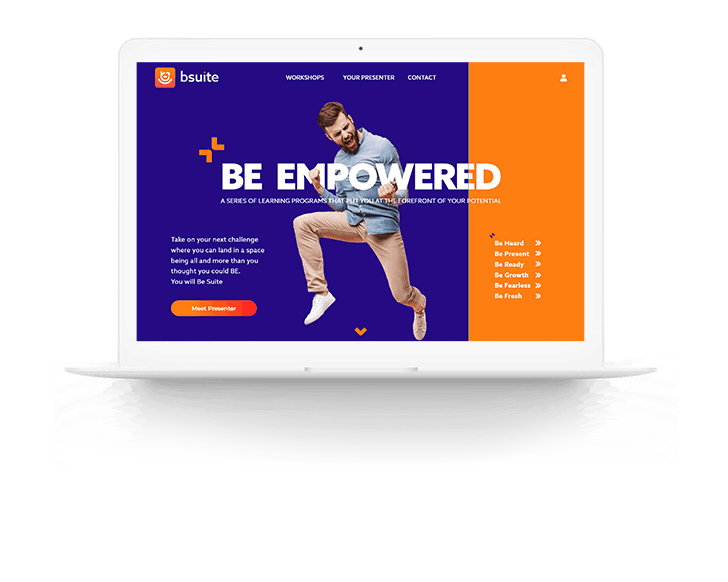
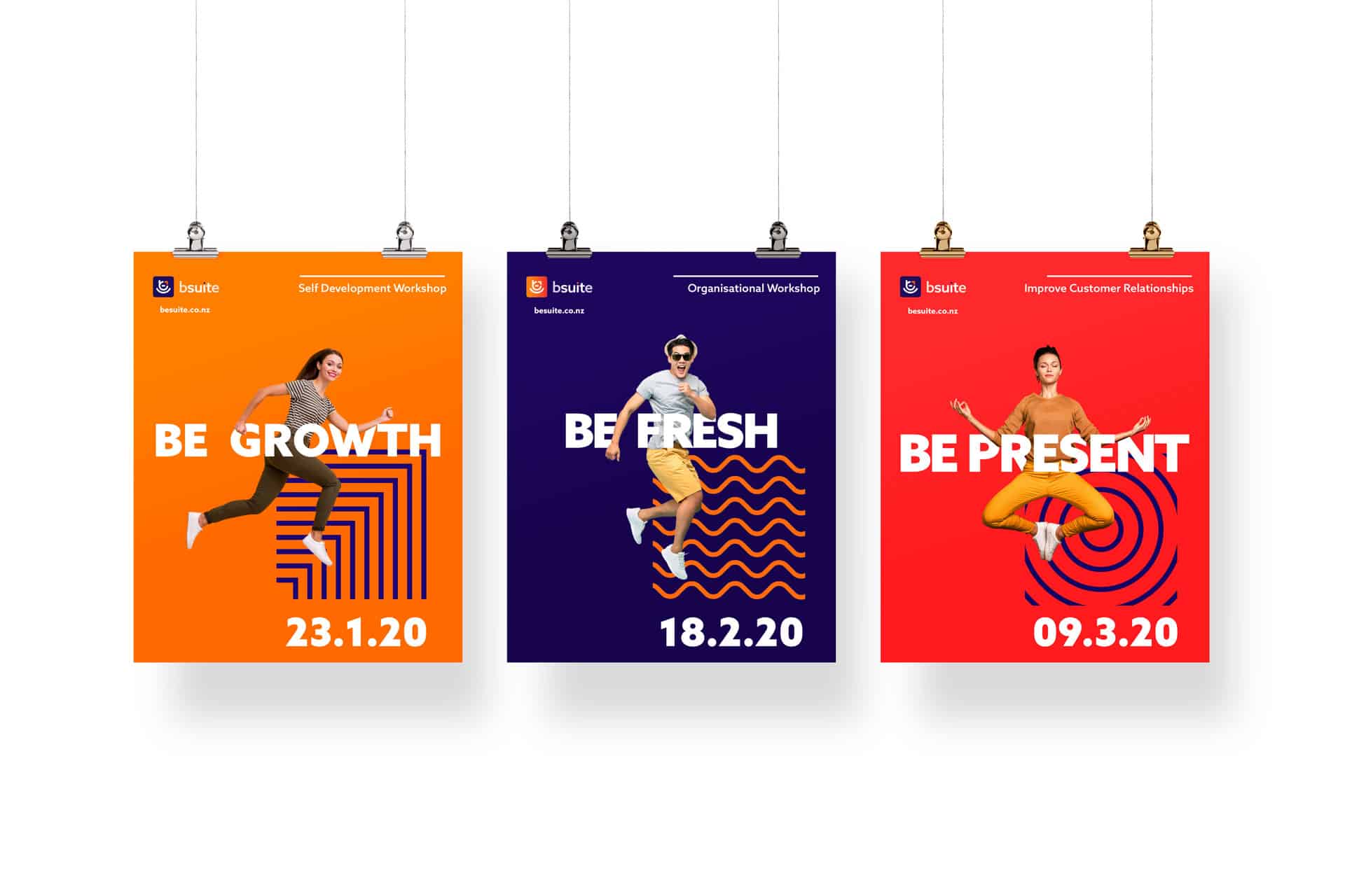
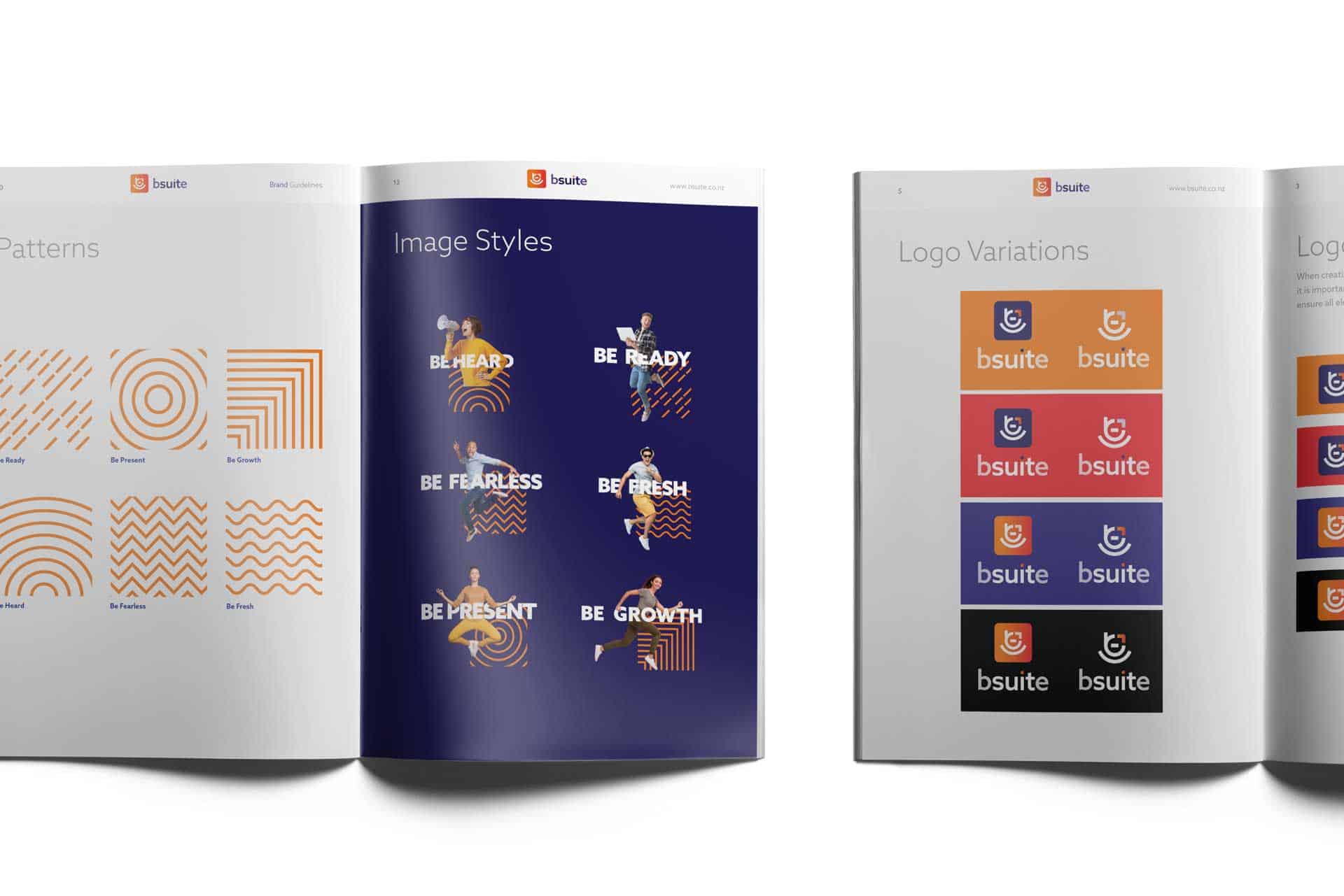
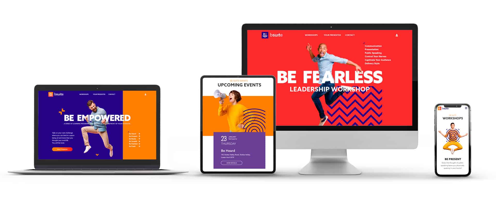
The Be Suite brand identity is centered around empowerment and self progression delivered through online and in-person workshops. Each workshop has a unique learning outcome so the visual identity needed to be visually differentiated from each other.
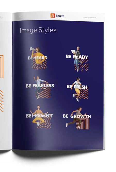
The workshops are fun, engaging and empowering, so these values needed to be represented within the brand imagery to give the user a sense of the workshop series. The look and feel needed to be modern and have elements of “digital natives” that resonate with the audience.
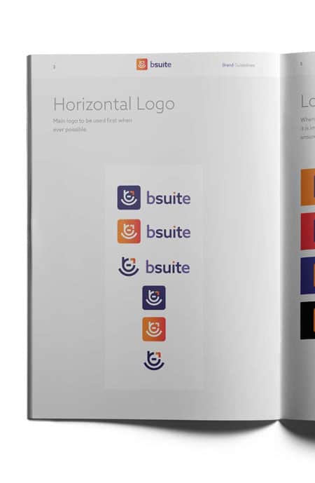
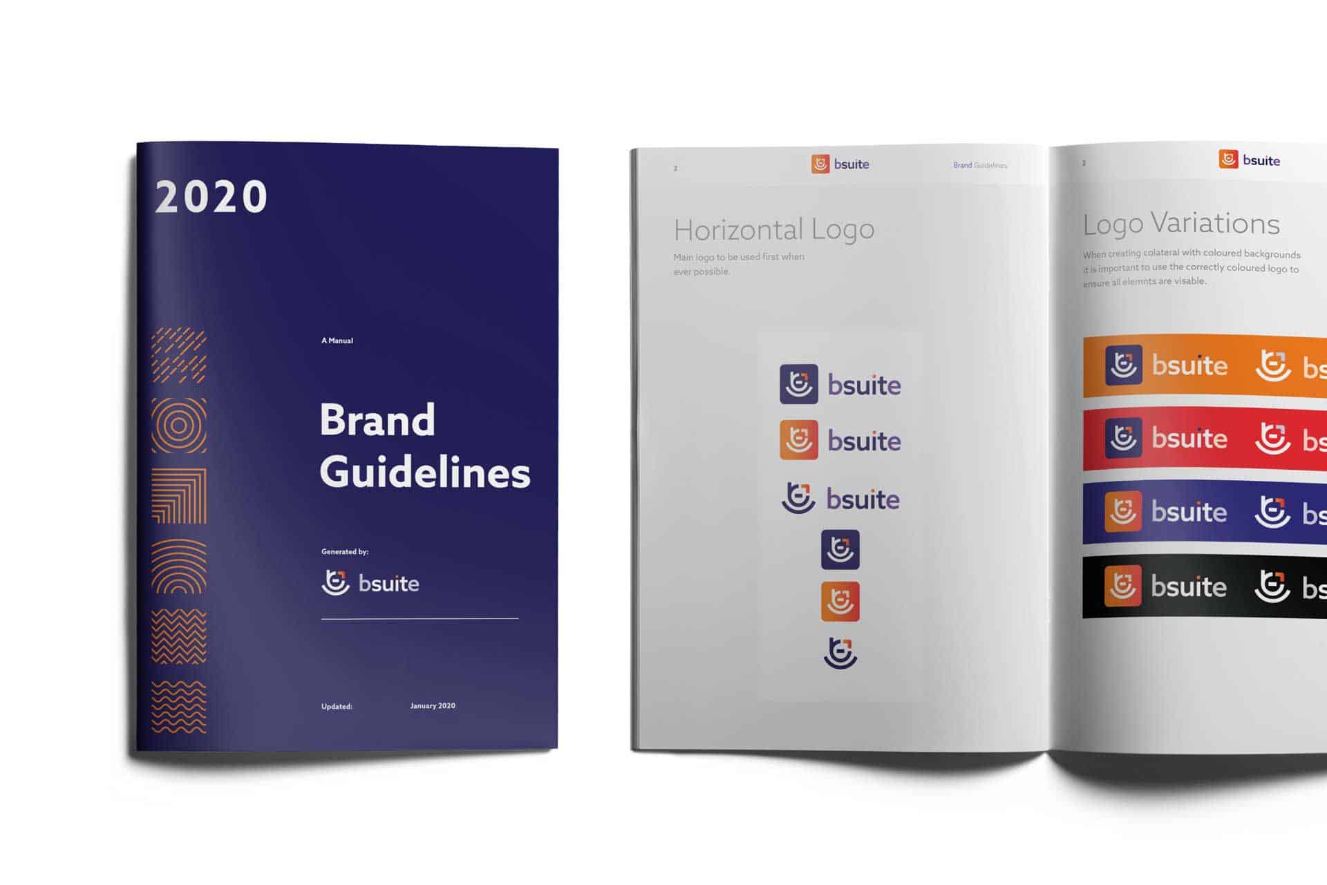
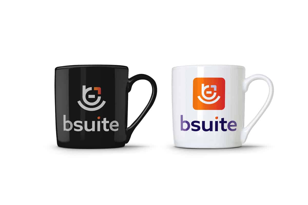
The logo design and icon creation needed to be unique, convey passion and energy whilst positioning Be Suite as a professional training and development company. The icon is a combination of the “be”, a progress arrow, a person and meditation, so to give the viewer a unique perspective on the brand depending on the underlying semiotic relationship to the individual.
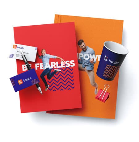
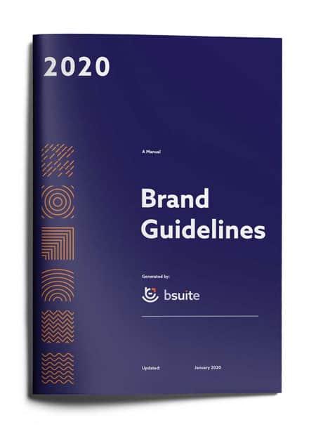
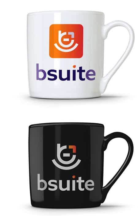
The graphic design collateral outputs of the brand included presentation material, booklets, poster, website, workbooks, business cards, social media and digital artwork.
The Work
Be Suite Logo
The Work
Be Suite Icon
The Work
Be Patterns
The Work
The Designs


OUR CLIENTS SAID
Testimonials
We’ve worked with large corporate businesses, SMEs, startups and non-profits across a range of creative, digital and consultancy projects.
Here’s what our clients have to say about what we’ve been able to achieve together.


